
To construct a path diagram we simply write the names of the variables and draw an arrow from each variable to any other variable we believe that it affects. We can distinguish between input and output path diagrams. An input path diagram is one that is drawn beforehand to help plan the analysis and represents the causal connections that are predicted by our hypothesis. An output path diagram represents the results of a statistical analysis, and shows what was actually found.
So we might have an input path diagram like this:
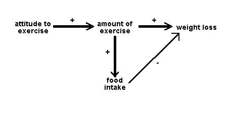
Figure 1: Idealised input path diagram
And an output path diagram like this:
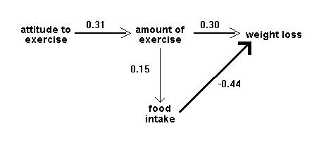
Figure 2: Idealised output path diagram
It is helpful to draw the arrows so that their widths are proportional to the (hypothetical or actual) size of the path coefficients. Sometimes it is helpful to eliminate negative relationships by reflecting variables - e.g. instead of drawing a negative relationship between age and liberalism drawing a positive relationship between age and conservatism. Sometimes we do not want to specify the causal direction between two variables: in this case we use a double-headed arrow. Sometimes, paths whose coefficients fall below some absolute magnitude or which do not reach some significance level, are omitted in the output path diagram.
Some researchers will add an additional arrow pointing in to each node of the path diagram which is being taken as a dependent variable, to signify the unexplained variance - the variation in that variable that is due to factors not included in the analysis.
Path diagrams can be much more complex than these simple examples: for a virtuoso case, see Wahlund (1992, Fig 1).
Although path analysis has become very popular, we should bear in mind a cautionary note from Everitt and Dunn (1991): "However convincing, respectable and reasonable a path diagram... may appear, any causal inferences extracted are rarely more than a form of statistical fantasy". Basically, correlational data are still correlational. Within a given path diagram, patha analysis can tell us which are the more important (and significant) paths, and this may have implications for the plausibility of pre-specified causal hypotheses. But path analysis cannot tell us which of two distinct path diagrams is to be preferred, nor can it tell us whether the correlation between A and B represents a causal effect of A on B, a causal effect of B on A, mutual dependence on other variables C, D etc, or some mixture of these. No program can take into account variables that are not included in an analysis.
What, then, can a path analysis do? Most obviously, if two or more pre-specified causal hypotheses can be represented within a single input path diagram, the relative sizes of path coefficients in the output path diagram may tell us which of them is better supported by the data. For example, in Figure 4 below, the hypothesis that age affects job satisfaction indirectly, via its effects on income and working autonomy, is preferred over the hypothesis that age has a direct effect on job satisfaction. Slightly more subtly, if two or more pre-specified causal hypotheses are represented in different input path diagrams, and the corresponding output diagrams differ in complexity (so that in one there are many paths with moderate coefficients, while in another there are just a few paths with large, significant coefficients and all other paths have negligible coefficients), we might prefer the hypothesis that yielded the simpler diagram. Note that this latter argument would not really be statistical, though the statistical work is necessary to give us the basis from which to make it.
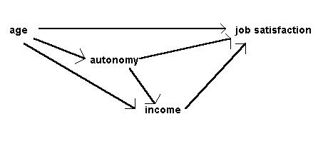
Figure 3: Input diagram of causal relationships in the job survey, after Bryman & Cramer (1990)
To move from this input diagram to the output diagram, we need to compute path coefficients. A path coefficient is a standardized regression coefficient (beta weight). We compute these by setting up structural equations, in this case:
satisfaction = b11age + b12autonomy
+
b13 income + e1
income = b21age + b22autonomy
+ e2
autonomy = b31age + e3
We have used a different notation for the coefficients from Bryman and Cramer's, to make it clear that b11 in the first equation is different from b21 in the second. The terms e1, e2, and e3 are the error or unexplained variance terms. To obtain the path coefficients we simply run three regression analyses, with satisfaction, income and autonomy being the dependent variable in turn and using the independent variables specified in the equations. The constant values (a1, a2, and a3) are not used. So the complete output path diagram looks like this:
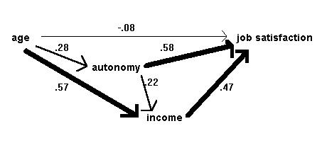
Figure 4: Output diagram of causal relationships in the job survey, after Bryman & Cramer (1990)
If the values of e1, e2,
and e3 are required, they are calculated as the
square root of 1-R2 (note not 1-R2adj)
from the regression equation for the corresponding dependent
variable.