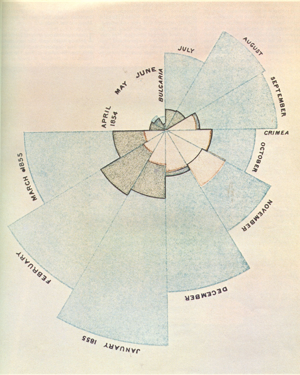
The polar area diagram was invented by Florence Nightingale to dramatize the extent of needless deaths in British military hospitals during the Cirmean War (1954-56). The area of each colored wedge, measured from the center, is proportional to the statistic being represented. Blue wedges represent deaths from "preventable or mitigible zymotic" diseases (contagious diseases such as cholera and typhus, pink wedges deaths from wounds and gray wedges deaths from all other causes. Mortality peaked in January 1855 when 2761 died of contagious diseases, 83 of wounds and 324 of other causes. Based on the army's average strength of 32393, Nightingale computed an annual mortality rate of 1174 per 1000. Diagram from Bernard Cohen, "Florence Nightingale," Scientific American, March 1984. Originally from Nightingale's book Notes on Matters Affecting the Health, Efficiency and Hosptal Administrtion of the British Army, published in 1858.